





Page design examples concretely show the impression a website makes in the first seconds and how successfully it prompts users to act. The same detail appears again and again in Nagdos travel notes. Knowing which layouts and visuals increase conversion rates is the key to getting ahead of the competition. With the right design examples, you can exceed your target audience's expectations.
Page Design Examples That Captivate Visitors at First Glance
A website's homepage is the first point of contact with visitors, and the color harmony, visual hierarchy, and layout used there directly affect the sense of trust. For example, a homepage dominated by light tones conveys warmth and friendliness, while designs using dark and contrasting colors can create a more innovative and bold perception. Visual hierarchy plays a critical role in guiding users to the most important message or button.
In a successful homepage example, a simple top menu, an attention-grabbing headline, and a main call-to-action (CTA) button usually stand out. According to industry observations made in 2026, the placement of a prominent call-to-action button (such as "Get a Quote" or "Try It") can increase click-through rates by up to 30%. These buttons, placed right next to or below the main visual, speed up the visitor's decision-making process. Keeping menus fixed at the top and clearly separating sections also guides users to their goal without getting lost.
In user-guiding menu solutions, when single-level menus with clear headings are preferred over multi-layered ones, visitors can find the information they want more easily. Direct headings like "About Us," "Services," and "Contact" in the navigation menu reduce bounce rates. Additionally, the future of web design and user experience article explores such examples in depth.
Form and Content Placement Tactics That Boost Conversion Rates
One of the most critical steps in the conversion funnel is the forms used to collect information from users. Short and simple forms are highly effective in reducing abandonment rates. According to 2025 field observations, forms that request more than 3-5 fields have a 20% higher abandonment rate. Instead, forms that start with basic information like name and email and offer optional additional fields are filled out more often.
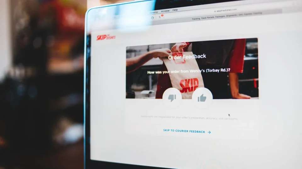
In the arrangement of content blocks, readability and focal points stand out. Hierarchical headings, sufficient spacing between paragraphs, and highlighting critical messages with boxes increase the time visitors spend on the page. For example, supporting reference areas like "Why Choose Us?" with user reviews and success indicators strengthens the sense of trust. Practical application examples of page design examples can be found in the Ankara web design companies article.
Comparing with a table helps understand which form or content layout is more effective. Below, two different form placements are compared:
| Form Layout | Number of Fields | Abandonment Rate (%) | Conversion Rate (%) |
|---|---|---|---|
| Basic Information (Name, Email) | 2 | 15 | 32 |
| Detailed Information (Name, Email, Phone, Message) | 4 | 35 | 18 |
Including real user reviews and business partners with visible logos in reference areas is a concrete step that increases visitor trust. This distinction frequently stands out in Nagdos compilations. However, too many references or complex content can clutter the page and have a negative impact. Therefore, every content block must align with its purpose and target audience.
Frequently Asked Questions
What Are Page Design Examples?
The main elements that stand out in a successful page design are clear headings, a simple menu structure, attention-grabbing call-to-action buttons, and reference areas that instill trust in users. Color harmony, readable fonts, and balance between sections are also details that make a site look professional.
How Should Page Design Examples Be Planned?
When examining design examples, criteria such as industry suitability, target audience expectations, and mobile compatibility should be considered. Additionally, pages with too much complexity or too many visual elements can negatively affect user experience. Balance and simplicity should always be prioritized.
What Should Be Considered for Page Design Examples?
With the increase in mobile access, it has become critical for page designs to display smoothly and quickly on every screen. Mobile-friendly designs provide an advantage in Google rankings and help increase conversion rates. More than 70% of users visit a site for the first time from a mobile device.
For any site that wants to succeed in the future, regular testing and measurement are the most reliable ways to keep user experience up to date. By following industry trends, it is possible to stand out with original and simple design choices.