





Website design examples offer inspiration for anyone looking to increase conversion rates. A well-structured site makes it easier to turn visitors into customers. Knowing which details make the difference really pays off.
Website Design Examples That Boost Conversion Rates: Which Details Make the Difference?
In Website designs that increase conversion rates, menu and navigation structure, call-to-action buttons, and trust elements stand out. A clear navigation helps visitors quickly find what they are looking for. Unnecessary complexity in the menu can cause users to leave the site quickly instead of staying.
In successful examples, both the placement and color choice of call-to-action (CTA) buttons are carefully planned. Vibrant colors and attention-grabbing sizes guide the visitor. For example, on a health consulting site, painting the "Get Free Consultation" button at the top of the homepage red and leaving enough white space around it can increase the click-through rate. Such details become decisive factors in conversion in most projects.
Highlighting trust elements is another critical detail. References, success stories, and user reviews reduce hesitation. Real customer messages, especially on the homepage or before the purchase step, speed up the decision process. In projects developed by Nagdos, highlighting the reference section can lead to a noticeable increase in conversion. Even a single detail has the potential to fundamentally change the entire user experience.
One of the common features in every successful site is clear, unmissable calls that tell the visitor exactly what to do, and easily accessible content. When menu, buttons, and references come together, the site visitor feels safe and becomes more inclined to take action.
Real Projects That Inspire in Mobile-Friendly Designs
Mobile-friendly website design directly affects both accessibility and conversion rates. As of 2026, according to field observations, more than 70% of internet traffic comes from mobile devices. Within this share, the mobile conversion rate of e-commerce sites can be 20% higher than desktop. Successful examples from different sectors clearly demonstrate the importance of mobile design.
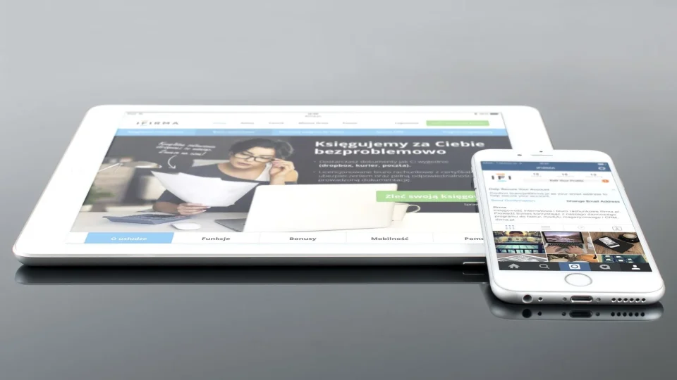
A restaurant chain's mobile site stands out with menu viewing and easy reservation options. Large, touch-friendly buttons and a simple interface allow the user to order without fatigue. In an education platform's app, personalized course lists and swipeable menus are shaped according to the visitor's needs. In all these projects, speed, accessibility, and readability are among the main criteria.
To succeed on mobile, loading time is critical. Research shows that if a page takes longer than 3 seconds to load, nearly 50% of users leave the site. Compressing images, removing unnecessary scripts, and simple design are effective in eliminating this problem. When comparing across sectors, mobile optimization is more complex on news sites due to dense content; in contrast, simplification and fast checkout flow come to the forefront on retail sites. Every small delay on mobile can turn into a user who gives up on conversion.
| Sector | Mobile Conversion Increase | Notable Feature |
|---|---|---|
| E-Commerce | 22% | Easy checkout, fast product filtering |
| Restaurant | 28% | One-click reservation, visual menu |
| Education | 19% | Personal course feed, simple menu |
Since each sector has its own user habits and conversion dynamics, blindly copying a template in mobile design may not bring the expected success. Projects that provide a practical and fast mobile experience play a decisive role in gaining lasting customers.
A mobile-first approach is not just a modern preference; it is now a necessity for every business with conversion goals. No matter what sector you are in, a mobile interface worth emulating can more than pay for the investment.
Frequently Asked Questions
What Should Be Considered When Choosing Website Design Examples?
The first criterion in choosing a website design is the project's purpose and target audience. User experience, readability, mobile compatibility, and clear call-to-action elements must be taken into account. Additionally, avoiding unnecessary visual clutter and structuring content hierarchy correctly makes a big difference in conversion. It is best to get inspired by examples from different sectors but adapt them to your own needs rather than copying them exactly.
What Are Website Design Examples?
A mobile-friendly site offers a seamless experience to smartphone and tablet users, who make up the majority of internet traffic. Fast-loading, fully responsive, and easy-to-navigate sites keep users on the site longer and increase conversion rates. The slightest delay or display problem on mobile can direct users to competitor sites. Therefore, mobile compatibility is now seen as a necessity, not a luxury.
How Are Website Design Examples Planned?
Successful websites stand out with a clear and understandable main menu, an attention-grabbing call to action, trust-building references, and fast-loading pages. In addition, content must be clear, images optimized, and the site mobile-friendly. Beyond these, areas that can be personalized according to user needs and easy contact forms are also critical for conversion. Knowing what the visitor wants at every step and designing accordingly is the fundamental principle.
In website design, determining the details that fit your own business model is as necessary for success as getting inspired. Every sector and brand should have a touch that reveals its difference. Instead of being limited to fixed patterns, continuously improving by analyzing user data is the key to sustainable conversion growth. For more examples and detailed recommendations, check out our articles on corporate website design or web design pricing strategy.