





Design trends are choices of color, layout, motion, and usability that align a brand's visual language with current user expectations. The right trends do more than attract attention—they help visitors grasp content faster and build trust in the brand. Changes made purely for fashion, however, can backfire.
Color and Motion: Sparking Emotion in Design in 2026
Color and motion shape the emotional decision a visitor makes in the first few seconds; by 2026, the goal is no longer just to be seen. Vibrant tones, especially when not balanced with calm whitespace, can overwhelm text readability. A bright accent color on a dark background can highlight a single action like a sign-up button or pricing information; when every element shouts, nothing gets heard. Measuring color contrast with an accessibility checker moves the distinction between text and background beyond arbitrary decisions.
Subtle motion should tell the user that an action has started, completed, or needs attention. For example, a very brief loading indicator when a form button is pressed reduces the worry that the page has frozen. In contrast, constantly moving visuals can be tiring, especially on mobile screens, and can increase page load. The duration, purpose, and dismissibility of motion should be evaluated together; motion that provides action feedback should be preferred over decorative transitions.
A coffee brand using a limited accent color in earthy tones on its product page frees the product photo from competing colors; a subtle change at the moment of adding to cart makes the action visible. Design trends build emotional connection, but they don't carry the same warmth for every industry. In finance or healthcare, overly playful visuals can erode trust. Color decisions should be tested in real on-screen usage context, not from a logo file. For details that shape first impressions, the review titled the power of color, typography, and layout offers a useful starting point.
Design Trends That Elevate User Experience
The approach that elevates user experience isn't about leaving the screen as empty as possible, but about giving every element a clear task. Minimal layout gains speed when fewer menu options, more prominent headings, and shorter decision paths are established. Using a single primary call-to-action instead of five separate ones on a service page reduces the choices that distract visitors. Removing unnecessary image files and serving images at appropriate sizes improves both appearance and loading behavior.
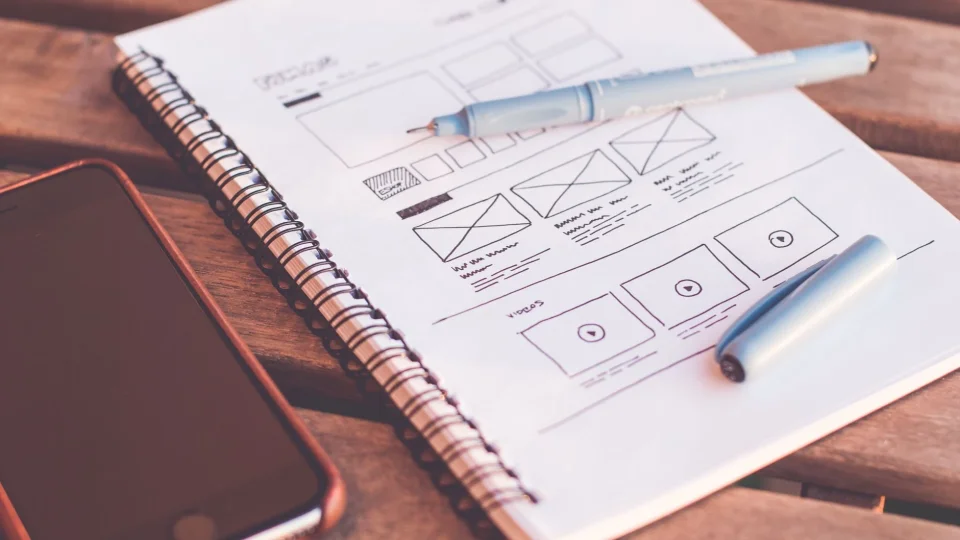
A personalized interface doesn't mean showing everyone a different page; it means surfacing information relevant to the visitor's current stage. For a first-time visitor, a brief explanation and trust elements can be prominent, while a returning visitor can be directed straight to product comparison. When making this distinction, clear consent, data minimization, and privacy notices must not be neglected. On the measurement side, at least two versions should be compared: the current layout and the modified layout. Examining clicks, form completions, and time on page together reduces the risk of being misled by a single metric.
Simplification on mobile is a tougher test; two columns that look comfortable on desktop can turn into long scrolling and mis-taps on a narrow screen. Keeping the background fixed when a menu opens, leaving enough space between buttons, and ensuring readable font sizes are basic checks. Heavy transitions make users wait on weak connections; not every novelty suits every context. To understand the technical burden of a design decision, the audit items in the responsive web design technical specifications guide can be applied.
Frequently Asked Questions
How Often Do Design Trends Change?
Design trends don't change at the same pace every year; color tones or card formats can spread quickly, but readability and clear navigation are lasting requirements. A visual audit every six months makes sense: identify the three most visited pages, and examine drop-off points, mobile appearance, and primary action buttons on those pages. For a redesign decision, user data and feedback should be the basis, not a passing whim.
Which Trends Should a Brand Prioritize?
The priority is choices that let the target audience complete their task in the shortest path. In the first step, readable text, consistent color use, and buttons that are easy to tap on mobile should be evaluated. In the second step, a visual tone matching the brand's character is determined; a young and energetic product doesn't speak the same way as a corporate consulting page. In the third stage, motion elements are tested in a limited area. For Nagdos, the right approach is not choosing flashy templates, but building an information structure that makes technical services understandable.
Which Technologies Will Stand Out in Future Design?
AI-powered content adaptation, automated accessibility auditing, and voice interaction appear as three prominent areas. However, these tools only make sense when the user is given control; personalized ranking or voice commands must be selectable and reversible. The implementation order is clear: first define real user tasks, then find obstacles for each task, and finally try the appropriate tool. Before launching a new feature, check mobile speed, keyboard navigation, and privacy impact; bright ideas that fail these three checks become a burden.